Masonry Gallery
Once WPMozo Widgets is activated it adds a number of widgets to the Elementor builder. To insert the Masonry Gallery widget, use the following steps.
- Create/edit a page/post that uses Elementor builder.
- Create/edit container.
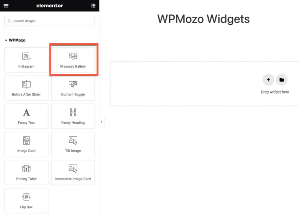
- Search widget Masonry Gallery under WPMozo.
The Masonry Gallery for Elementor is a powerful tool that allows you to create visually appealing and dynamic gallery layouts on your website.
After successfully incorporating the Masonry Gallery widget onto your page, the next steps involve fine-tuning the display to meet your preferences. As outlined in our documentation, the widget offers a range of settings related to both content and design.
Content Customization
Content
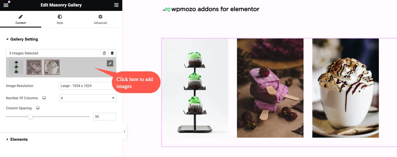
Gallery Setting
How to Add Images in the Gallery
To add images to the Masonry Gallery widget, navigate to the Content tab and select the first option called “Gallery Setting”. Within the Gallery Setting, you will find a plus button, which you can click on to add images to your gallery.
After clicking on the plus button, you will be presented with the following options:
- Edit Gallery: This option allows you to customize the gallery within the widget. You can make changes to the images, their order, captions, and other gallery settings. To add the images to the widgets’ gallery click on the second option Add to the gallery.
- If you do not have any images in the widgets’ gallery, it will show no content.
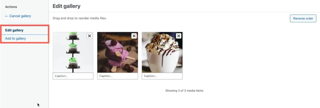
- Add to Gallery: This option enables you to add images from your website’s media library to the widget’s gallery. You can select the desired images and include them in your Masonry layout.
- Drag and Drop to Reorder Media Files: With this functionality, you can easily rearrange the order of the media files within the gallery. Simply click and drag the files to the desired position.
- Reverse Order: This option allows you to reverse the order of the media files in the gallery.
- Caption: This option allows you to add captions to the images in the Masonry gallery. You can provide descriptive text or additional information to accompany each image.
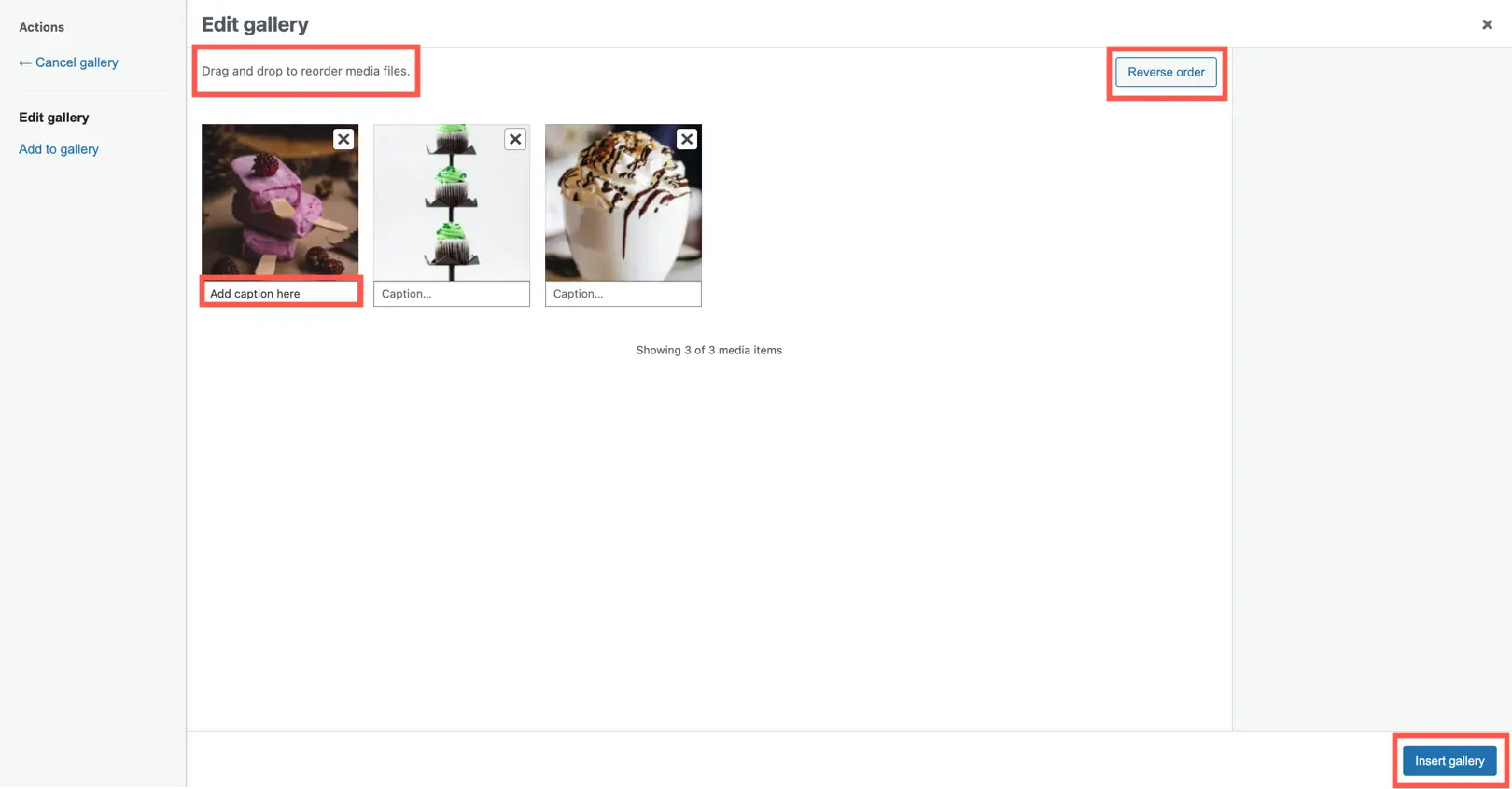
Note: After changing the image order click on the button Insert Gallery to update the image order.
Image Size
when selecting the image size within the Masonry Gallery widget, you will have access to various size options, including:

- Thumbnail: This is a small-sized image typically used for displaying thumbnail previews.
- Medium: This refers to a medium-sized image that can be used for general purposes.
- Medium Large: This size option provides a slightly larger image compared to the medium size.
- Large: This is a larger image size suitable for showcasing images with more detail and visual impact.
- WooCommerce Thumbnail: Specifically designed for WooCommerce, this image size is used for product thumbnails in online stores.
- WooCommerce Single: This size option is optimized for displaying a single product image in WooCommerce.
- WooCommerce Gallery Thumbnail: This image size is tailored for the gallery thumbnails in WooCommerce product pages.
- Full: This option allows you to use the original, full-size image without any resizing or cropping.
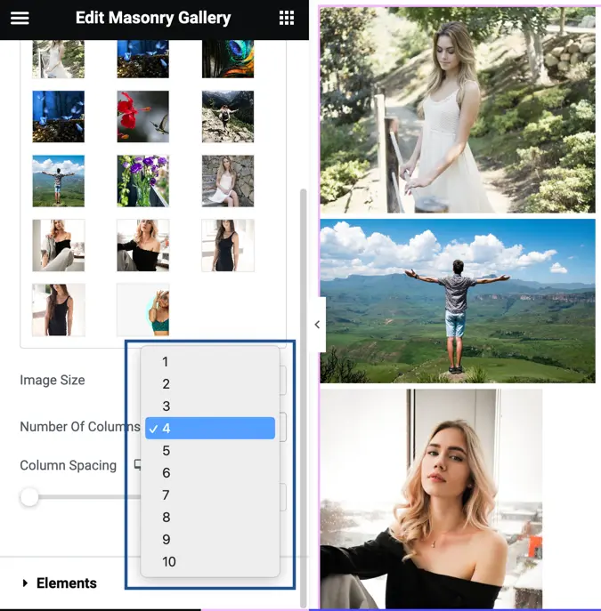
Number of Columns
The Number of Columns setting provides you with the flexibility to choose how many columns you want to display your images in. You have the freedom to select any number of columns between 1 and 10.
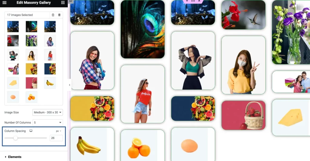
Column Spacing
The Column Spacing option allows you to adjust the amount of space between the columns in your gallery layout.
Elements
The Elements settings offer several options to customize the display of titles, captions, and lightbox functionality:

- Show Title : This setting allows you to display the title of each image in the gallery.
- Show Title in: You can choose where to display the title. Options include “Lightbox,” “Gallery,” or “Both” (displayed in both lightbox and gallery).
- Show Caption: This option enables you to show captions for the images in the gallery.
- Show Caption in: Similar to the title, you can select where to display the caption, choosing between “Lightbox,” “Gallery,” or “Both.”
- Enable Lightbox: This setting enables the lightbox functionality, allowing users to view the images in a larger, overlayed view.
- Title & Caption Lightbox Style: You can choose the placement of the title and caption in the lightbox, either “Below Image” or “Image Overlay.”
- Overlay on hover: This option enables an overlay effect when users hover over the images in the gallery.
- Overlay Icon: This setting allows you to choose an icon that will be displayed on the overlay when hovering over the images.
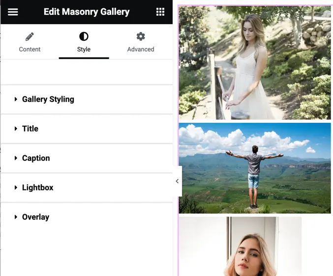
Design Customization
Style
Gallery Styling
The Gallery Styling option provides various customization settings for the overall appearance of the gallery:
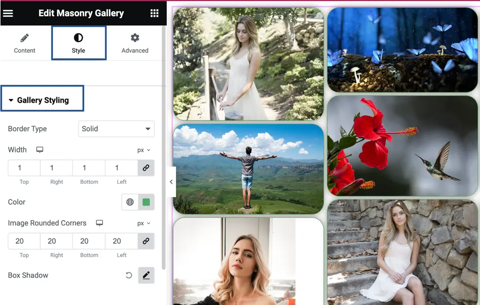
- Border Type: This setting allows you to choose the type of border for the gallery items. You can select options such as solid, dashed, dotted, or none.
- Width: With this option, you can specify the width of the border around the gallery items. You can enter a numerical value or select from preset options.
- Color: This setting allows you to define the color of the border for the gallery items. You can choose a color from a color picker or enter the color’s hexadecimal code.
- Image Rounded Corners: Here, you can set the level of rounded corners for the images within the gallery. You can adjust this value to create a softer, rounded appearance or keep it at zero for sharp corners.
- Box Shadow: This option enables you to add a box shadow effect to the gallery items. You can specify the shadow’s properties, such as color, size, blur, and position.
Title
The Title Styling option provides various settings to customize the appearance of the titles displayed with each gallery item. Here are the available options:
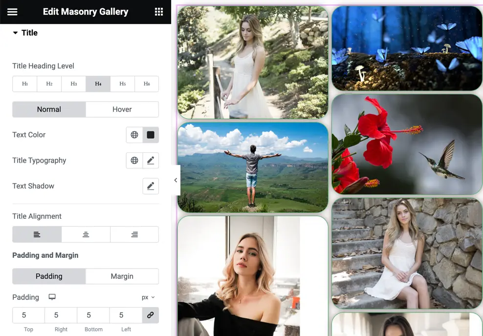
Title Heading Level: This setting allows you to specify the HTML heading level for the title text, such as H1, H2, H3, etc.
On Normal State:
- Text Color: You can choose the color of the title text using the color picker or by entering the hexadecimal code.
- Title Typography: This option enables you to customize the typography properties of the title text, including the font family, font size, font weight, letter spacing, etc.
- Text Shadow: Here, you can apply a shadow effect to the title text by adjusting the shadow color, size, and blur.
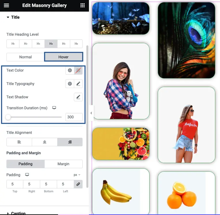
On Hover State:
- Text Color: This setting allows you to define the color of the title text when hovering over it.
- Title Typography: Similarly, you can customize the typography properties (font family, font size, font weight, etc.) specifically for the title text in the hover state.
- Text Shadow: If desired, you can also set a text shadow effect for the title text when hovering.
- Transition Duration: This option lets you specify the duration of the transition effect when the title text changes states (e.g., from normal to hover). The value is defined in milliseconds
Title Alignment: You can choose the alignment of the title text, such as left, center, right, or justified.
Padding and Margin: These settings allow you to adjust the spacing around the title text by setting values for padding and margin.
Caption
The Caption Styling options provide similar functionality to the Title Styling options, allowing you to customize the appearance of the captions in the Masonry Gallery, including text color, typography, alignment, padding, margin, and more.


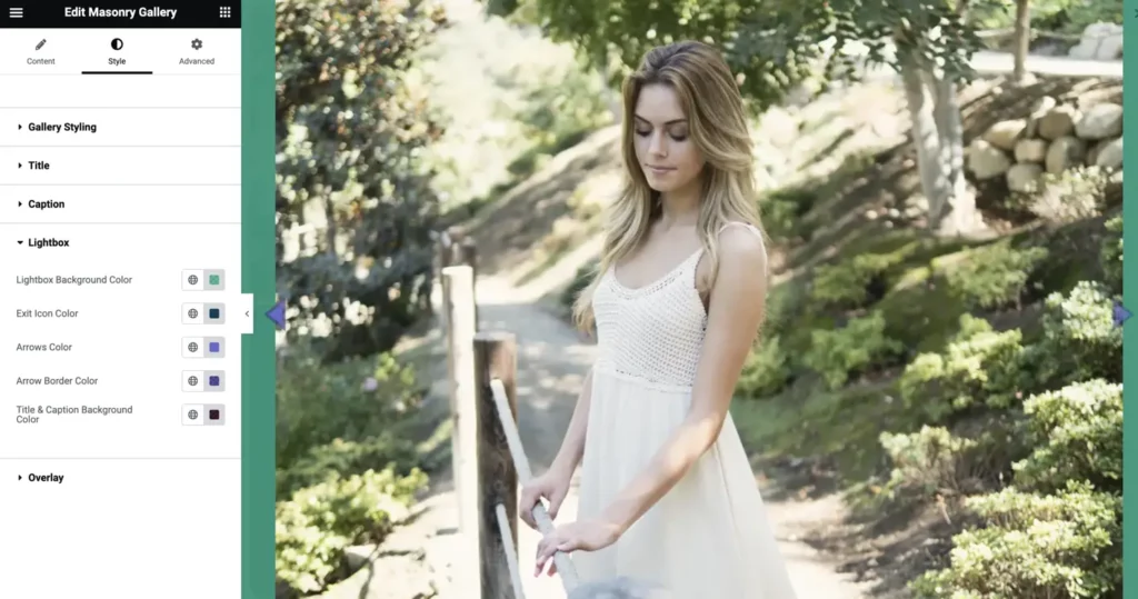
Lightbox
In the Lightbox settings, you have several options to customize the appearance of the lightbox display. These options include:
- Lightbox Background Color: This setting allows you to choose the background color for the lightbox.
- Exit Icon Color: You can customize the color of the exit icon displayed in the lightbox, which allows users to close the lightbox and return to the gallery.
- Arrows Color: This option enables you to specify the color of the arrows used for navigating between images in the lightbox.
- Arrow Border Color: You have the ability to customize the color of the border surrounding the arrows in the lightbox.
- Title and Caption Background Color: This setting allows you to define the background color for the title and caption area displayed within the lightbox.
Overlay
In the Overlay settings, you have the following customization options:
- Icon Size: This setting allows you to adjust the size of the overlay icon displayed on the gallery items.
- Overlay Icon Color: You can customize the color of the overlay icon, which is displayed on top of the gallery items.
- Overlay Background Color: This option allows you to define the background color of the overlay that appears when hovering over the gallery items.
