Content Toggle
Content Toggle widget allows you to create sections on your website that can switch between different types of content. You can use it to display text, and show predefined templates, or pages, making your website more engaging and user-friendly.
How to Add Widget on Page
Once the WPMozo Addons plugin is activated, it adds several widgets to the Elementor builder. To insert the Content Toggle widget, follow these steps.
- Create/edit a page/post that uses Elementor builder.
- Create/edit container.
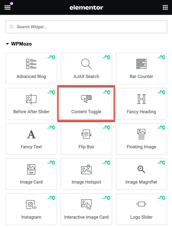
- Search widget Content Toggle under WPMozo.
Following the seamless integration of the Content Toggle widget onto your page, the next phase involves refining the presentation to align with your specific preferences. As detailed in our documentation, this widget provides an array of settings that cater to both content and design elements. These settings grant you the flexibility to mold the toggle functionality according to your unique vision.
Content
Toggle Content
Toggle Title: Here you can specify the title for the toggle.

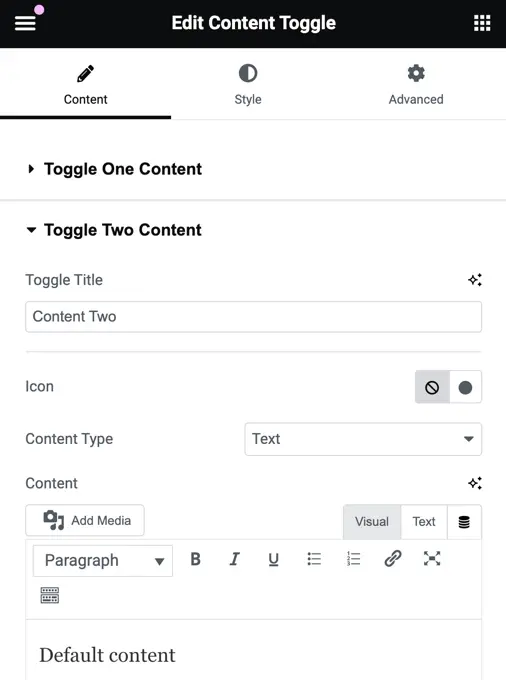
Content Type: You have the choice of text, template, or page.

Content: What you can add here depends on the content type you’ve chosen. If you select ‘text,’ you’ll be provided with a text input area. If you opt for ‘template,’ you can select a template. If you go with ‘page,’ you’ll see a list of all the pages on your site.
Style
In this setting, you can personalize the toggle switcher, the text displayed on the toggle switch, and the text within the toggle contents

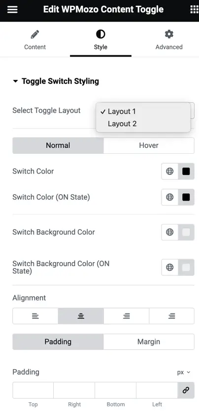
Toggle Switch Styling
Here you get two toggle layout options, and you can further customize the layout for both normal and hover states. In this customization, you can adjust the switch color, switch color in the “on” state, switch background color, switch background color in the “on” state, alignment, padding, and margin.
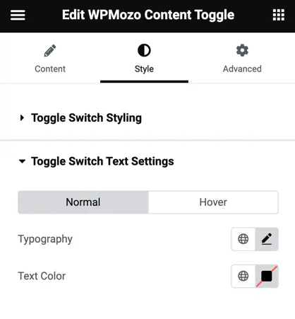
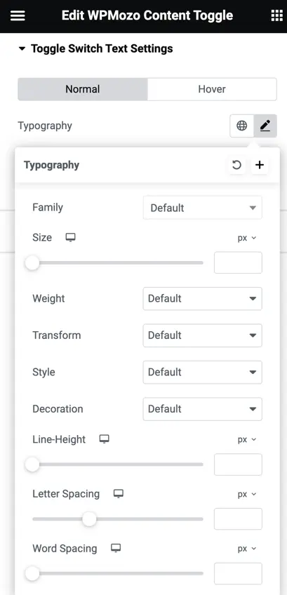
Toggle Switch Text Settings
In this section, you can choose the typography and text color of the switch text for both the normal and hover states.
You can use the typography settings to choose the font style, size, boldness, and other text appearance options to customize how the text looks on your website.
Content Text Settings
Set the Color of the Text:
Choose the color you want the text to appear in.
Customize the Text Style:
You can change the font, size, boldness, and other visual aspects of the text.
Add a Text-Shadow:
This is an effect that can make the text stand out by creating a shadow behind it.
Control the Alignment:
You can decide whether the text should be aligned to the left, center, right, or justified (aligned to both the left and right edges).
Adjust the Spacing:
You have the ability to add some space around the text. This can help with the layout and overall appearance of the text.
