Search WPMozo Addons for Elementor Documentation
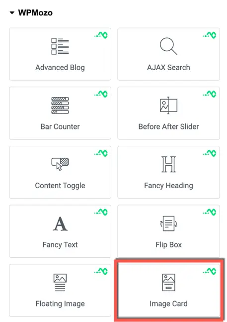
Image Card
Once the WPMozo Addons plugin is activated, it adds several widgets to the Elementor builder. To insert the Image Card widget, follow these steps.
- Create/edit a page/post that uses Elementor builder.
- Create/edit container.
- Search widget Image Card under WPMozo.
Content

Image
Choose Image: This setting allows you to upload or select an image from your media library to be displayed on the image card.
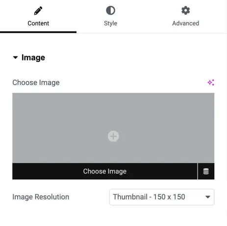
Image Resolution: Here, you can specify the resolution type for the image. You have the following options:
- Thumbnail: A small-sized image typically used for thumbnails.
- Medium: A medium-sized image suitable for general use.
- Medium Large: A slightly larger version of the medium-sized image.
- Large: A larger version of the image suitable for featured images or headers.
- WooCommerce Thumbnail: An image size specifically tailored for WooCommerce product thumbnails.
- Single: The original image size.
- Gallery Thumbnail: An image size suitable for use in galleries.
- Full: The full-size original image.
- Custom: Allows you to set a custom size for the image.

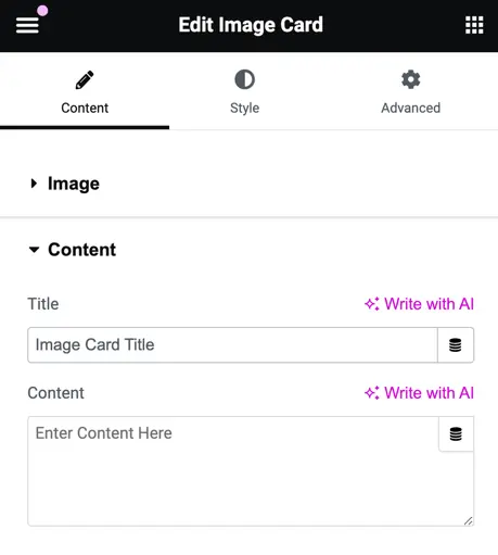
Content
- Title: This field is for adding the title of the image card.
- Content: Here, you can input the content or description associated with the image card.
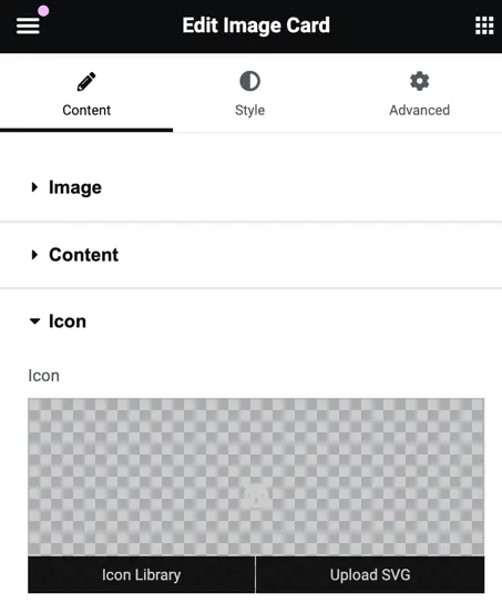
Icon
- You can upload the icon from the library or upload an SVG file.
Button
- Button Title: Enter the text for the button.
- Button URL: Provide the URL where the button should redirect.
- Button Icon: Upload an icon for the button or choose from the library.
- Icon Position: Select the position of the button icon, either left or right.
- Show Icon on Hover: Toggle to enable/disable the button icon visibility on hover.
